
Why build an "offline-first" hiking app
Most of Taiwan's best hiking routes lose signal the moment you enter the mountains. Plenty of map apps on the market claim to offer offline features, but in reality they just cache a few screenshots — the moment you zoom or pan into an area that wasn't captured, it's blank. ZhuiZhui chose to use a vector map engine to download the complete terrain map to your phone — a decision that made development considerably more difficult, but the payoff is a map you can genuinely rely on deep in the mountains.
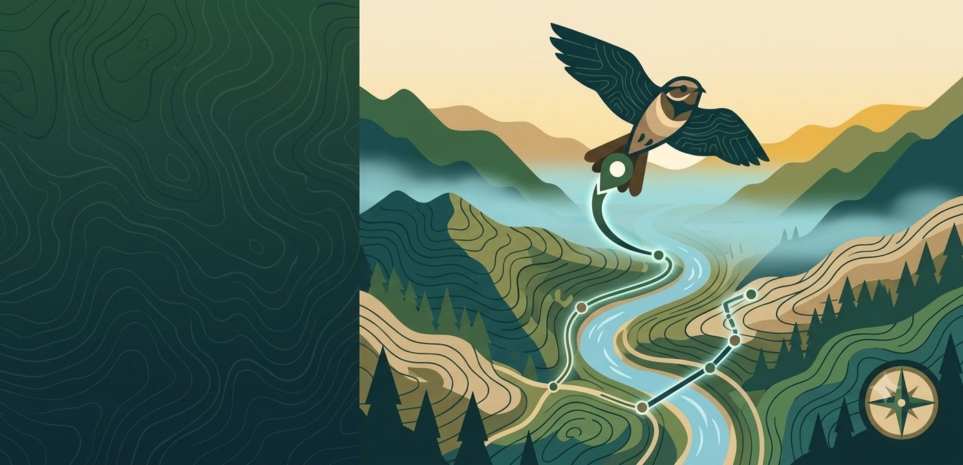
Color-blind-friendly design, not an afterthought
Plenty of map and route apps on the market use red for danger and green for safety, or distinguish layers with similar red-green tones — a design that's often hard for some users to tell apart.
That's why ZhuiZhui has used the Okabe-Ito color-blind-friendly palette (an academically validated color scheme) throughout the app from day one: map legends, live track lines, chart colors — all avoid relying on red-green contrast alone to convey key information. This isn't an accessibility feature bolted on afterward — it's been a built-in design principle from the start.
Got an idea to share?
Email us at idearipplecilaya@gmail.com — any suggestions or feedback are welcome.